
Introduction: Why I Built This Dashboard
Lately, I’ve had a bit more time to dive into personal projects, and one area I wanted to focus on was my fitness. Back when I worked a desk job, I realised my daily step count and activity levels were naturally low. So, I set out to re-establish a fitness baseline—something I could measure against once I was back in a full-time, screen-heavy routine.
The challenge? There wasn’t an easy way to compare my “before and after” fitness data. Most people might stop there. But I couldn’t resist the chance to turn this into a data project.
About the Dataset
It’s relatively straightforward to get an extract of your data from Fitbit. In my case, I pulled together five years’ worth of activity data—a hefty 2.66GB spread across thousands of files. These came in a mix of CSV, JSON, and TXT formats, covering everything from daily steps to heart rate metrics.
It was a goldmine of information, but also a puzzle: the data was scattered across hundreds of raw and calculated metrics, so the first challenge was simply deciding where to start.
Behind the Scenes: Data Modelling & Transformation
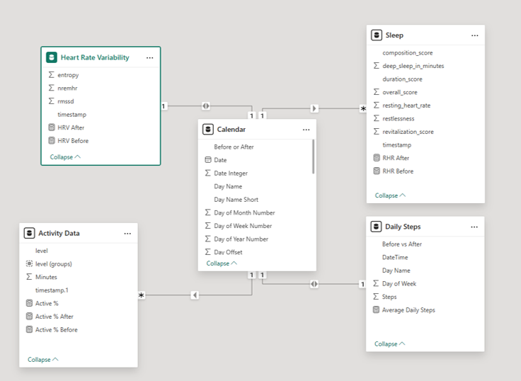
The bulk of my time went into wrangling the data into something manageable. A few key design decisions made all the difference:
- Filtering early: I used the folder data source and filtered files by their date-stamped names. This cut the dataset from nearly 2,000 files down to about 150—hugely improving refresh performance.
- Creating a calendar table: Since all my fitness data was linked by date, a calendar table was essential. It allowed me to join different metrics seamlessly.
- Choosing the right granularity: Minute-by-minute step counts weren’t necessary for my analysis. By grouping the data, I kept the model lean without losing meaningful insights.
Individually, these steps were small, but together they created a flexible model that made the dashboard possible.
Designing the User Experience
I wanted the final dashboard to feel less like a spreadsheet of numbers and more like a conversation with a doctor—clear, visual, and insightful.
A few design choices helped bring this vision to life:
- Consistent colours: I borrowed Fitbit’s own colour palette—not out of laziness, but intentionally. Colour has a big impact on how our brains process data, and using familiar tones helps users get into the “fitness mindset” faster.
- Clear metric descriptions: Each metric comes with an explanation, so the story behind the numbers is obvious.
- Pop-out detail views: Bookmarks linked to info icons let users dive deeper into individual metrics without cluttering the main dashboard.
The result is a dashboard that balances clarity with depth, giving users the ability to see both the big picture and the finer details of my fitness journey.
Conclusion: From Data to Insight
Building this dashboard not only gave me a clearer picture of my own health, but also showed me the power of combining personal data with thoughtful design. With a few smart transformations and design choices, I was able to turn a mountain of Fitbit files into something meaningful and easy to explore.
For me, it’s a tool to stay accountable and track progress over time. For others, I hope it’s an example of how data—when structured well—can tell a story worth listening to. I’d encourage anyone with a fitness tracker to have a look at the data and see what extra insights you can gain.