Introduction: Why I Built This Dashboard
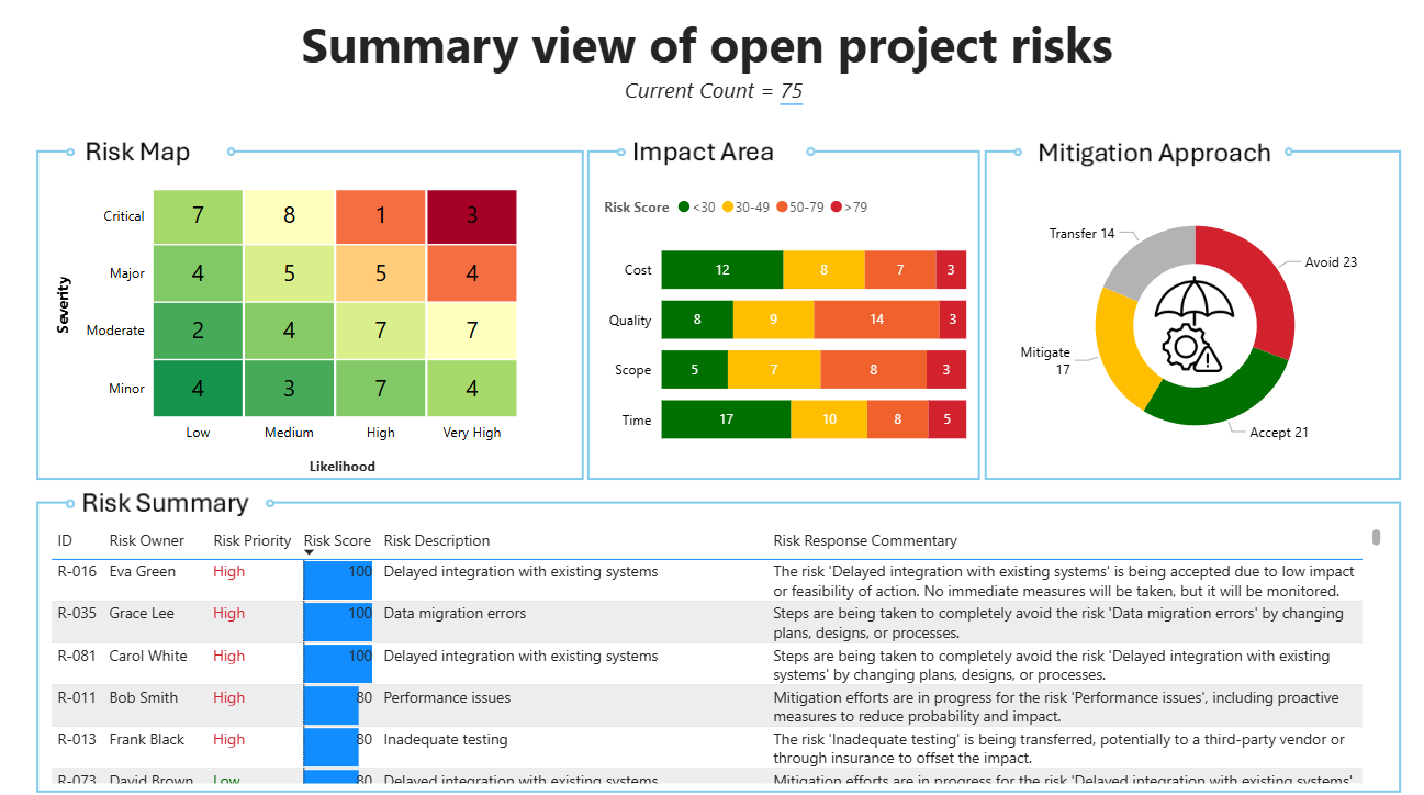
Too often, I’ve seen risk logs trapped in messy spreadsheets—hard to navigate, painful to update, and hard work to maintain. I wanted to show a better way of approaching this. That’s why I built this Power BI dashboard: to show what’s possible when we move beyond Excel and PowerPoint into smarter, scalable tools for PMO activity.
About the Dataset
The data for this report sits in a simple spreadsheet – data is generated by Chat GPT and is only there for illustrative purposes. In a real client scenario, I’d store this in a SharePoint list—giving better version control, auditability, and smoother collaboration for teams
Behind the Scenes: Data Modelling & Transformation
Although the dashboard looks straightforward, a few key modelling decisions make it more powerful and scalable. Here’s what’s happening under the hood:
- Folder Data Source: Even though I’m only using one file right now, I’ve connected Power BI to a folder. This makes future refreshes easier—just drop the new file in and the model automatically picks up the latest version.
- Ordering Tables – This prevents awkward alphabetical sorting (like ‘High, Low, Medium, Very High’).
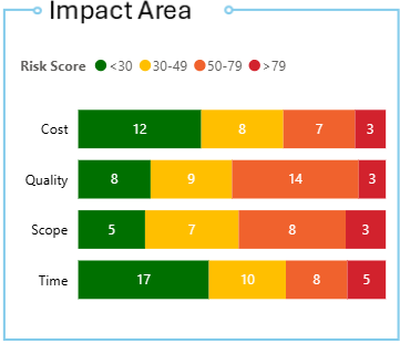
- Risk score groupings – Clusters 1–100 scores into meaningful bands for clearer comparisons.
- Reference table for impact areas – Splits multiple different impacts into separate rows for each risk, enabling cleaner relationships and richer visuals.
Designing the User Experience
Good UX makes or breaks a risk dashboard. I focused on keeping things simple, clear, and aligned to how people scan and process risks.
- Custom risk map (Charticulator Visual) – I created using the Charticulator visual which I’d forgotten existed. If you’re struggling to get the out of the box visuals to do something for you, chances are you can create it with Charticulator.
- Colour coding – It’s not perfect but I’ve tried to ensure that attention is drawn to red areas.
- Dynamic risk count – Kept deliberately subtle to avoid misleading ‘good/bad’ signals from a single number.
Enhancements
This version is illustrative, but if I were deploying it for a client, here are the enhancements I’d build in to make it production-ready:
- SharePoint List as a master log –This offers a better and more controlled experience for people who need to update the risk data.
- Row Level Security (RLS) – I’d use RLS to create an additional tailored views that show individuals the risk they own.
- Raw history drill through – This would provide more detailed risk information.
Conclusion
This project shows how risk management doesn’t have to mean clunky spreadsheets. With Power BI, we can create tools that are cleaner, more scalable, and genuinely useful for transformation delivery. It’s a small step away from Excel—but a big step toward smarter PMO practices.