Introduction: Why I built this dashboard
This report was born out of frustration.
I kept coming across clickbait-style articles ranking nurseries in my local area using care inspectorate scores—but with no real context or insight. The rankings were misleading, lacked nuance, and offered little value to parents trying to make informed decisions.
So I decided to build something better.
My goal was to create a Power BI report that would give parents the tools to explore nursery data in a meaningful way, tailored to their local area. I wanted it to be clear, interactive, and genuinely useful—putting the power of data into the hands of the user.
More on the data set
The data for this report comes from a structured CSV extract published by the Care Inspectorate. It includes inspection scores and metadata about registered nurseries.
The structure made it easy to work with: I created a simple data model in Power BI and was able to focus quickly on building out the visuals.
Under the Hood – Data modelling and transformation
While the report appears simple on the surface, there are a few important things happening behind the scenes:
- Folder Data Source: Even though I’m only using one file right now, I’ve connected Power BI to a folder. This makes future refreshes easier—just drop the new file in and the model automatically picks up the latest version.
- Scoring Categories: I created additional categorical groupings based on inspection scores. These weren’t directly used in the final report, but were helpful in the exploratory phase for clustering and comparison.
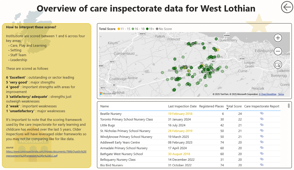
- Data Freshness Flag: I added a conditional column to flag reports older than five years. This gives users quick visual context about the timeliness of the data.
Designing the User Experience
A good report doesn’t just display data—it guides the user.
Here are some key visual and UX decisions I made:
- Cover Page: I designed the landing page to immediately connect users with the dataset. It includes a location dropdown so users can dive straight into their area of interest.
- Context First: To help users understand what they’re looking at, I placed a dataset description on the left-hand side of the report—aligned with natural reading patterns in Western cultures (left to right, top to bottom).
- Dynamic Links: The dataset includes a unique ID for each nursery. I used this to create clickable links to the corresponding Care Inspectorate page—done via a custom column in Power Query. It’s a simple touch, but it allows users to verify the source and explore further if they wish.
Conclusion: A Tool for Parents, Powered by Data
This was a rewarding report to build—clean data, a clear user need, and an opportunity to use Power BI to democratise access to insights.
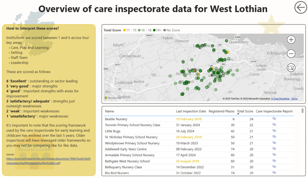
The final product is a user-friendly dashboard that helps parents explore how nurseries in their local area are assessed. It empowers them with accurate, contextual data—and moves beyond shallow rankings to provide something genuinely useful.